Tuesday, April 17, 2012

6th grade self portraits


The sixth grade classes starting to work on oil pastel painted self portraits.  In the past, I have had the students create a grid across the black and white photo, then slowly transfer the image by drawing the lines and shapes found in each square in the grid onto grid squares on their drawing paper.  However, I found that the grid drawings take a LONG time.  Too long!  So, we have taken a short cut and left out the drawing aspect of the project.

Instead, we are simply going straight to the painting step of the project.  Here are the steps as we followed them:

  • After receiving an 8" x 10" black and white photo of themselves on plain copy paper, students use a pencil to outline every value change they can identify in the image.  
  • Then students create a 5 level value scale in black and white. 
  • Next, students select one to three colors of oil pastel, a black, and a white.
  • Using the oil pastels, they create a color scale right on the gray scale that matches each value.
  • Now students can use the value scale to select the right paint value to go in each area that they outlined in the beginning and paint RIGHT ON THE PHOTO!

Thursday, February 9, 2012

3rd grade - A bowl called 'Seppo'

Today in class we learned about a special bowl known as 'Seppo'. It was created by a Raku master named Hon'ami Koetsu in the early 1600's in Japan. It is a ceremonial tea bowl.

Raku is a form of pottery that focuses on the unique aspects and natural imperfections found in hand built and wood fired pottery. It ties in with the Japanese philosophy of wabi-sabi. Wabi-sabi is the art of finding beauty in imperfection. The concept includes the idea that hand built pottery cannot be replicated because each piece has unique imperfections. This makes each piece profoundly valuable since cannot be recreated exactly and it is irreplaceable.

There is a story I told the students about this particular bowl that is absolutely thrilling! Rather than re-tell it here, ask your student to tell you the story of the 13 year war that was fought for this bowl! At the end of the war, it was broken, then repaired using gold! Part of the concept of wabi-sabi is repair, don't replace. The addition of the gold repair increases the value rather than decreases it!

Look for an upcoming post about our third grade clay project! No, we are not doing Raku. We are hand building clay cups!

Tuesday, January 31, 2012

3rd & 4th grade - 3-D Forms

We will be spending this week in art class working on drawing in 3-D.

Last week, we went over the main Geometric Forms very quickly. Today we will go over them again more slowly so that everyone will have a chance to practice, practice, practice!

The forms we will mostly be working on are...


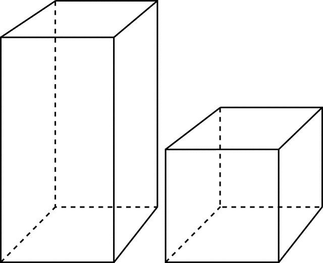
RECTANGULAR PRISMS (including cubes)


TRIANGULAR PRISMS (including pyramids)


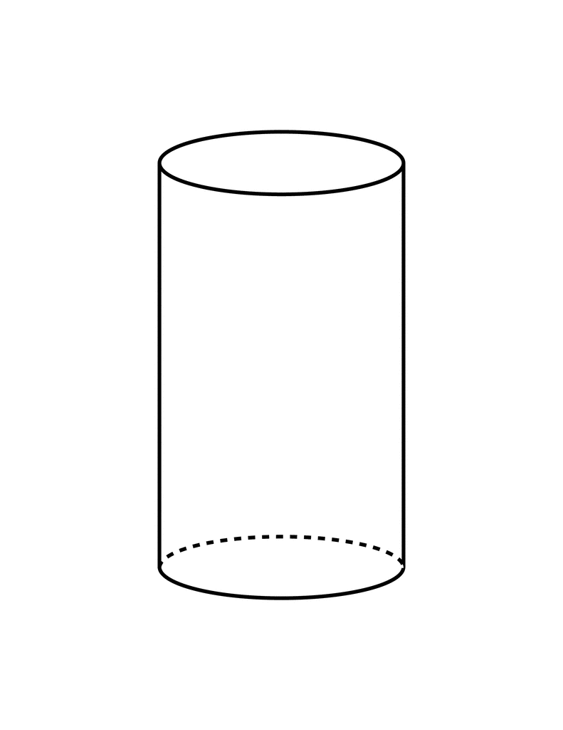
CYLINDERS


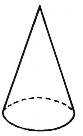
CONES


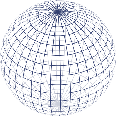
SPHERES

During this week, you will use these geometric forms to build 3-D drawings of houses, cars, and other objects around you!


Tuesday, January 17, 2012

5th grade - Human Body Proportion

The fifth grade classes are working on drawing believable people.  That means figuring out all the correct bones and joints in a 'stick figure'.  This simply doesn't cut it...


Instead, we can use a drawing mannequin to help us figure out how to draw the basic 'skeleton' of a person... with joints, long bones, pelvic bone, and rib cage!


Here are some basic generalizations that can help you to draw people.  Keep in mind that they are generalizations, which means that all people are their own unique measures, but we can use these generalizations as a starting point.


  • Adult humans are generally 7 to 8 heads tall.  
  • Legs are half our height.
  • Elbows align with the belly button and swing out in a arc.
  • The neck is half the length of the head.
  • Feet are the same length as the inside of the forearm.

Wednesday, January 4, 2012

3rd Grade Color Harmony Example Project

Each student selected random objects throughout the art room to trace onto their paper.  Using a black crayon, each object was carefully outlined and the paper was quartered.

On the back of the paper, the students wrote the names of the four color harmonies that we learned about in class, then selected colors to fit each one.  Once the color choices were selected, the students painted each quarter of the artwork with its own harmony using watercolor paint.

This is a challenging assignment because it requires so much planning and understanding of color theory to do it well, but the students did a fantastic job!

Tuesday, January 3, 2012

6th grade - Two Point Perspective


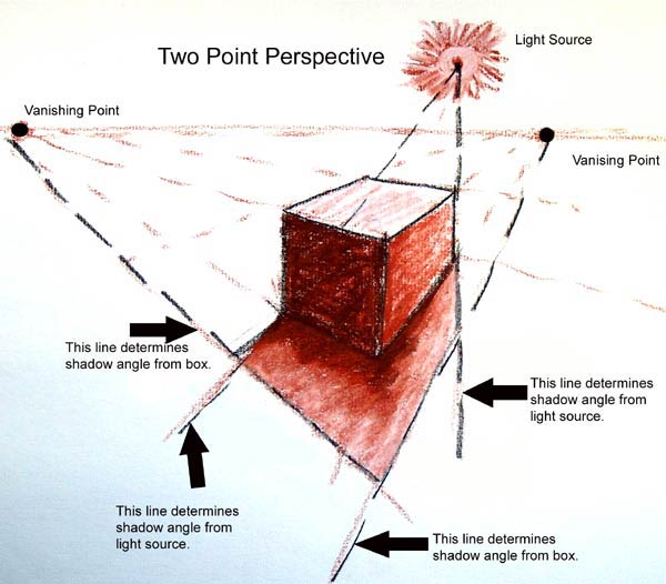
Two point perspective is the next step after you master one point perspective.  This perspective happens when you are looking at an edge of an object.  When this happens, the object appears to be connected to two vanishing points on the horizon line that are wide spread.  Two point perspectivce actually looks more real to life than one point because people see things from an edge (called an oblique angle) more often than head on (as in one point perspective).

The image above demonstrates how to create 2-point perspective.  Below is a drawing using two point perspective.


Since there is one point perspective and two point perspective, can there be more vanishing points?


YES!

Technically, you can use an infinite number of vanishing points.  This works really well if the furniture in your room is not all lined up with the walls.


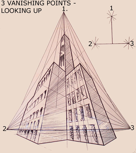
There is also something called 3 point perspective. 


This is useful for drawing a skyscrapper from the viewpoint of a pedestrian on the sidewalk, or a sun shadow being cast by a building.

3rd grade - Color Theory, part 2

Color Harmonies

Now that we have reviewed our color wheels and tint and shade, it is time for some new information on color!

When an artist chooses the colors to put in an artwork, there are some rules for choosing well. They are called COLOR HARMONIES.

A harmony is a collection of things that go well together. For instance, in music, a harmony is two or more notes that sound really nice when played at the same time. In art, a harmony happens when two or more colors are used next to each other that look really good together. There are many different color harmonies. We are learning four of them this year. They are ANALOGOUS, COMPLEMENTARY, TRIADIC, and MONOCHROMATIC.

ANALOGOUS

An analogous color harmony is made up of colors that sit next to each other on the color wheel. These colors naturally blend together nicely and create a very calm and peaceful feeling picture. A perfect example is a sunset.


COMPLEMENTARY

A complementary color harmony is made of two colors that are opposites on the color wheel. Color opposites are very striking together and make a picture POP! They are very exciting together.


TRIADIC

A triadic color harmony forms a perfect triangle on the color wheel. The colors are exactly the same distance apart on all three point of the triangle. This creates a very balanced feeling picture.


MONOCHROMATIC


Mono means ONE. Chromatic means COLOR. So, monochromatic means ONE COLOR. A monochromatic picture uses tints, shades, and the original hue of one color. Monochromatic is not technically a harmony, since it is really only using one color, but we include it in this lesson anyway.

Friday, December 16, 2011

Mrs. Watson's still life


Of course, I won't ask my students to do something that I am not willing to do myself! Here is the still life I made while the students made theirs. This was done on a large sheet of gray paper taped onto the front board. I used crayon, so there was no erasing allowed for me! Fortunately for the students, they got to use pencils... and erasers!
Posted by Picasa

Tuesday, December 13, 2011

Still Life Project

Now that the basic drawing lessons are over, it is time to show off what you've learned! This is the simple still life that is set up in the art room for you. Your assignment, to draw and shade it from your perspective! Everyone's paper will look different, because everyone is looking at it from a different angle. As you work, make sure to look for details (like the reflections in the silver cylinder).

This is my example that is being created on the board as the class works!
Posted by Picasa

"I'm no good at drawing."

This is a common phrase that many children will say at one time or another.

My answer is simple.

"Of course your not that good at it, yet! If you were good at everything, you wouldn't need to go to school!"

Children have the mistaken idea that they have to be good at art the first time they try to draw a picture. I try to set them straight by comparing it to learning to play the piano. The first time anyone tries to play the piano, they are guaranteed to make plenty of mistakes, but that seems to be okay because it is expected. Everyone knows that if you want to get better at the piano, you have to practice. Visual art skills work the same way. Of course you will make lots of mistakes at first! That is completely normal! You will get better with practice!

This is true for all of those adults out there who decided sometime before 6th grade that they were "no good at drawing", too! You just need some lessons and lots of practice!

The amount of practice = the amount of success

If you don't practice at all, you'll never get better.

If you practice a little, you'll get a little better.


If you practice A LOT, you will be AMAZING!

Friday, December 9, 2011

proportion

Proportion means making sure each of the parts are the right size to be correct for the whole.  The best way to describe it is to imagine you are drawing a picture of a person.  If you were drawing a person, the arms should not be too long or too short.  It means making sure the head is not too big or too small for the body.  That sort of thing.

In class, each student selected an object out of the still life bins and practiced drawing in proportion.  They practiced doing basic comparison measuring to try to get the sizes right.  Comparison measuring means that you 'measure' the short side with your fingers, and compare that to the other sides.  If the short side counts as 'one', and the long side equals 3 of that 'one', you know to make it 3 times longer than the short side.

To work on this at home, select simple objects in the kitchen to draw.  A pot or pan works great!

Thursday, December 8, 2011

Shading a Ball reference photos


Here are some shots of the ball that the students looked at while learning to shade. As you can see, the angle of the light really affects how the shading needs to be done! If you want more practice, you can look at these photos and sketch in the shapes you see created by the effect of light and shadow.
Posted by Picasa

Shading a Ball - Student Examples


Here are some 6th grade examples of shading a sphere. It is fun to look at all the different angles of light and shadow in each picture. This is due to the fact that the ball was placed in the center of the room, with all the students sitting around it. Everyone had a different viewpoint.
Posted by Picasa

Tuesday, December 6, 2011

4th grade - Shading a ball

We started a shading lesson today.  Shading involves the Element of VALUE.  We also use the Element of SHAPE while working out where the lights and darks in the picture are placed.

I placed a playground ball on the center table in class and illuminated it with a lamp.  We talked about using the Element of SHAPE to lightly sketch in the shapes formed by the shadow on the table, the shadows on the ball, and even the dull light bouncing up on the back side of the ball from the table.

Students had an opportunity to walk around the room and see how the shadow shapes change on the ball depending on the angle you are viewing it.

6th grade - Color Wheel HOMEWORK!!!


Today I handed out the next homework assignment. It is a color wheel to fill out at home. You can use whatever coloring supplies you have on hand at home.

There are 3 rings on the color wheel. The outer ring should be the colors tinted, the middle ring is the pure hue, and the inner ring is the color shaded.

There are examples below of what it should look like in the 4 most common mediums (art supplies), crayon, colored pencil, markers, and watercolor paints.

If you lose your copy, click on the image and print a new one!


Friday, October 28, 2011

6th grade Halloween Portraits

There is an amazingly fun website called Picnik.com.  It is an online photo editing program.  There are three levels to it.

  1. Free play as a guest and upload one photo at a time.  The functions are limited but still quite fun.
  2. Free registered users get to upload 5 photos at a time, but the functions are still limited.
  3. Premium users pay an annual fee.  They can upload and work with up to 100 photos at a time, and all functions and features are unlocked for endless possibilities!
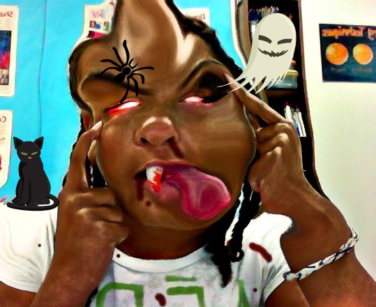
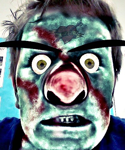
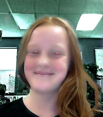
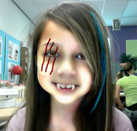
Miss Albaugh's 6th grade class had the opportunity this week to sit down with a class set of Mac iBooks and play with picnik.com.  Each student first took a self portrait using a program on the computer called Photo Booth.  Then they imported the Photo Booth shot into picnik.com and modified and edited using the most free and basic version to create a HALLOWEEN PORTRAIT!  Ah!  They had so much fun!

Here are the results!


Notes to other art teachers who may be thinking of doing this project:
  • Make sure you know the ins and outs of picnik before setting your students loose in it!
  • Spend at least 30 minutes demonstrating all the functions and how to undo.  A computer projector works great for this.
  • If you can't get a class set of computers brought into your classroom, but can get some computers, set up groups of students in group portraits and let them each edit themselves in the group shot.
  • Be aware of your airport's capabilities.  We had enough computers for each child, but the airport couldn't support that many online all at once in my classroom, so a few had to share.
  • It can be chaotic trying to orchestrate that many students in an online program, especially if there is a wide range of computing abilities in the group.  
  • In the event that the computer freezes mid edit, you can shut down the web browser and 'restart'. Picnik recognizes and reloads your last permutation. 
  • Picnik has a wide range of 'save and share' options.  Having the students e-mail their final project to me was the easiest way for them to "turn it in".