Last week, we went over the main Geometric Forms very quickly. Today we will go over them again more slowly so that everyone will have a chance to practice, practice, practice!
The forms we will mostly be working on are...
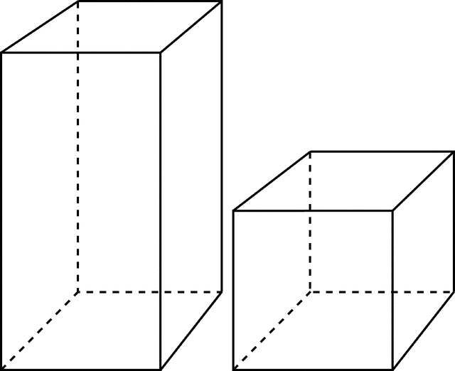
RECTANGULAR PRISMS (including cubes)

TRIANGULAR PRISMS (including pyramids)
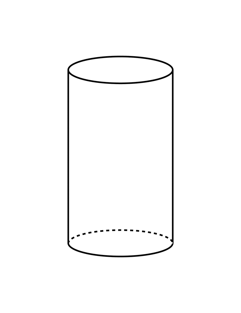
CYLINDERS
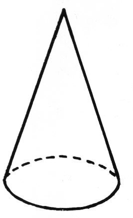
CONES

SPHERES
TRIANGULAR PRISMS (including pyramids)
CYLINDERS
CONES
SPHERES
During this week, you will use these geometric forms to build 3-D drawings of houses, cars, and other objects around you!


+dig+pics+015.jpg)