Showing posts with label 3rd. Show all posts

Thursday, February 9, 2012

3rd grade - A bowl called 'Seppo'

Today in class we learned about a special bowl known as 'Seppo'. It was created by a Raku master named Hon'ami Koetsu in the early 1600's in Japan. It is a ceremonial tea bowl.

Raku is a form of pottery that focuses on the unique aspects and natural imperfections found in hand built and wood fired pottery. It ties in with the Japanese philosophy of wabi-sabi. Wabi-sabi is the art of finding beauty in imperfection. The concept includes the idea that hand built pottery cannot be replicated because each piece has unique imperfections. This makes each piece profoundly valuable since cannot be recreated exactly and it is irreplaceable.

There is a story I told the students about this particular bowl that is absolutely thrilling! Rather than re-tell it here, ask your student to tell you the story of the 13 year war that was fought for this bowl! At the end of the war, it was broken, then repaired using gold! Part of the concept of wabi-sabi is repair, don't replace. The addition of the gold repair increases the value rather than decreases it!

Look for an upcoming post about our third grade clay project! No, we are not doing Raku. We are hand building clay cups!

Tuesday, January 31, 2012

3rd & 4th grade - 3-D Forms

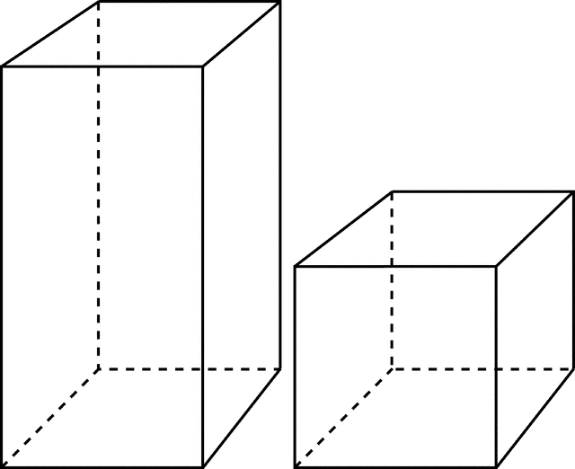
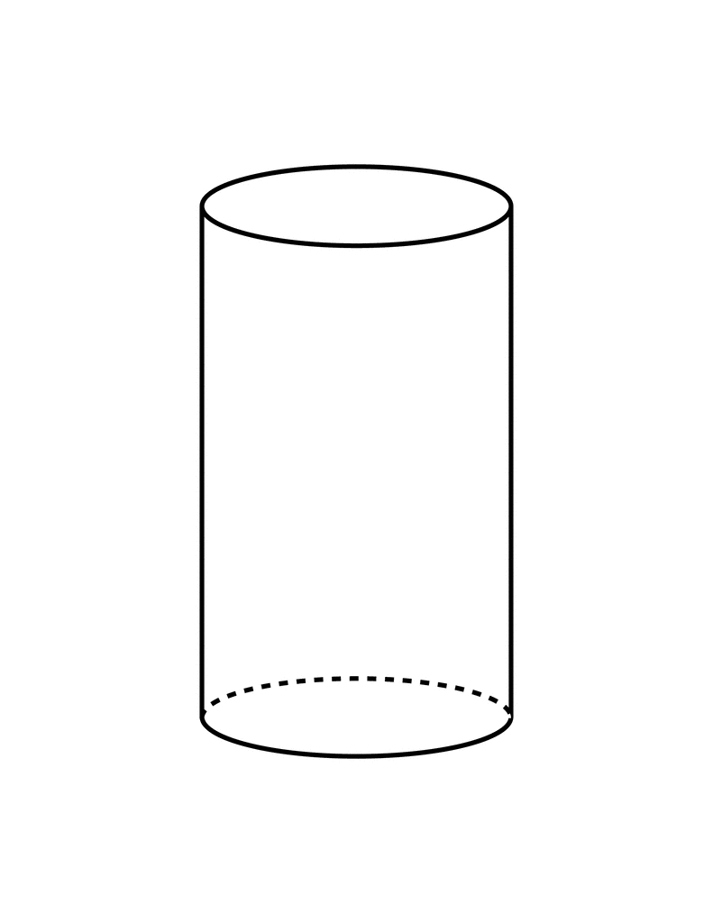
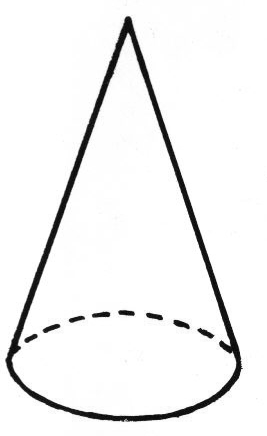
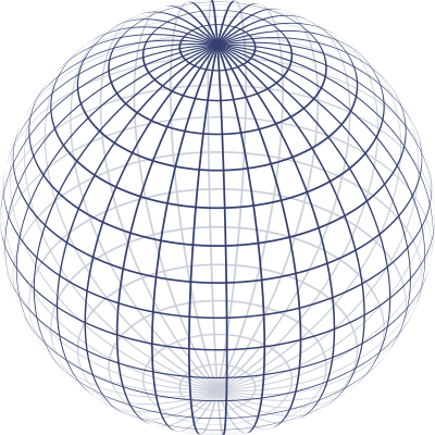
We will be spending this week in art class working on drawing in 3-D.

Last week, we went over the main Geometric Forms very quickly. Today we will go over them again more slowly so that everyone will have a chance to practice, practice, practice!

The forms we will mostly be working on are...


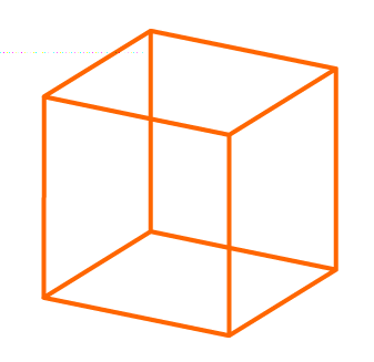
RECTANGULAR PRISMS (including cubes)


TRIANGULAR PRISMS (including pyramids)


CYLINDERS


CONES


SPHERES

During this week, you will use these geometric forms to build 3-D drawings of houses, cars, and other objects around you!


Wednesday, January 4, 2012

3rd Grade Color Harmony Example Project

Each student selected random objects throughout the art room to trace onto their paper.  Using a black crayon, each object was carefully outlined and the paper was quartered.

On the back of the paper, the students wrote the names of the four color harmonies that we learned about in class, then selected colors to fit each one.  Once the color choices were selected, the students painted each quarter of the artwork with its own harmony using watercolor paint.

This is a challenging assignment because it requires so much planning and understanding of color theory to do it well, but the students did a fantastic job!

Tuesday, January 3, 2012

3rd grade - Color Theory, part 2

Color Harmonies

Now that we have reviewed our color wheels and tint and shade, it is time for some new information on color!

When an artist chooses the colors to put in an artwork, there are some rules for choosing well. They are called COLOR HARMONIES.

A harmony is a collection of things that go well together. For instance, in music, a harmony is two or more notes that sound really nice when played at the same time. In art, a harmony happens when two or more colors are used next to each other that look really good together. There are many different color harmonies. We are learning four of them this year. They are ANALOGOUS, COMPLEMENTARY, TRIADIC, and MONOCHROMATIC.

ANALOGOUS

An analogous color harmony is made up of colors that sit next to each other on the color wheel. These colors naturally blend together nicely and create a very calm and peaceful feeling picture. A perfect example is a sunset.


COMPLEMENTARY

A complementary color harmony is made of two colors that are opposites on the color wheel. Color opposites are very striking together and make a picture POP! They are very exciting together.


TRIADIC

A triadic color harmony forms a perfect triangle on the color wheel. The colors are exactly the same distance apart on all three point of the triangle. This creates a very balanced feeling picture.


MONOCHROMATIC


Mono means ONE. Chromatic means COLOR. So, monochromatic means ONE COLOR. A monochromatic picture uses tints, shades, and the original hue of one color. Monochromatic is not technically a harmony, since it is really only using one color, but we include it in this lesson anyway.

Thursday, August 25, 2011

The Elements of Design (Visual Art)

The Elements of Design (sometimes called the Elements of Art) are the basic building blocks of art. Artists use these elements to plan and design their artwork. There are seven of them. They are Shape, Line, Color, Texture, Value, Space, and Form.

Shape

A shape is an enclosed figure. There is an inside and an outside. Shapes that have special mathematical rules are called geometric shapes. Examples of geometric shapes are circles, squares, rectangles, triangles, hexagons, etc.


Shapes that don't follow any special rules are called organic shapes. Organic shapes might look like something you recognize, like a leaf, or might simply look like a blob.


Line

In math, a line is the shortest distance between two points. In art, though, we are more free with the definition. Lines are not closed figures. They are open ended and can move across the paper in many different ways. Lines that follow a predictable pattern are called geometric lines. Zig-zag lines and wavy lines are examples of geometric lines. Lines that are completely unpredictable are called organic lines. Lines can be thick or thin, straight or curvy.


Color

We have been slowly learning about color every year since 1st grade. Colors are organized on a Color Wheel to help us see how they are related to each other. This year we are reviewing Primary, Secondary, and Tertiary. We will be learning Complimentary, Analogous, Monochromatic, and Triadic for the first time.


Texture
Texture is the way something feels when you touch it, or how it would feel if you could touch it. If you can really feel it when you touch it, it is called Real Texture. If you can't feel it when you touch it, it is Implied Texture.


Value
Value is every tone of a color from the darkest of the dark, to the lightest of the light. When you arrange them in order from lightest to darkest, it is called a Value Scale. When black and white are arranged in a Value Scale it is sometimes called a Gray Scale, or a Key Scale.


Space

When we talk about space in the art room, we are not talking about outer space! Space means creating a feeling of depth. Near and far. Front and back. The illusion of space is created on a flat paper by using overlap, size and placement, and details.


Form

Forms are 3-D shapes.  

You can create the illusion of form on a flat paper by shading to show where the light and shadow are, or you can use contour lines.  Contour lines follow the surface of a 3-D object. 


Here is an amazing image that demonstrates contour lines!

Thursday, February 10, 2011

2011 Third Grade Color Harmony Examples

Here are some third grade student examples of the four color harmonies we studied this year.


The students cut out a view finder into the center of a 6" x 9" piece of newsprint.  Then, each student found a magazine image that was interesting to them.  Rather than drawing the entire picture, however, the students used their view finders to 'zoom in' on one especially interesting portion of the picture and drew only that.  Once the initial drawing was complete, the students then traced it three times so that they had four copies of the same drawing.

Next, the students wrote each of the four color harmonies we learned onto the back of one of the pictures... analogous, complementary, triadic, and monochromatic.  Then they chose the colors they would use to represent each of the harmonies.

Using their planned colors, the students watercolor painted each of the four pictures, then finally glued them all together onto a backing paper... sort of Andy Warhol style!

Thursday, January 27, 2011

3rd grade - Color Theory, part 1

We have begun our review of Primary, Secondary, and Tertiary colors. Check out the 2nd grade postings on color for a complete review of last year's information.

This year we are learning about TINT and SHADE as part of our color theory.

TINT is created when white is mixed into a pure hue (color). The more white, the lighter the tint.

SHADE is created when black is mixed into a pure hue (color). The more black, the darker the shade.

TINTS and SHADES are represented on the color wheel. A tint and shade wheel looks like this.


Some people put tints on the inside of the wheel and shades on the outside, like this wheel. Other people put the shades to the middle. That is how we are doing it in class. There is no right way.

For a complete overview of all the color theory we will cover this year, visit http://www.tigercolor.com/color-lab/color-theory/color-theory-intro.htm.

Monday, January 24, 2011

Parent/Teacher Conferences

This Thursday and Friday evening will be parent/teacher conferences!  Parents of students currently in art are welcome to come into the art room, meet Mrs. Watson and Ms. Rowland, and learn about some of the art projects that are coming up this term.

In order to encourage parents to visit the art room, we are holding a prize raffle!  Just stop by to say hello, and enter your son's/daughter's name in the drawing for a chance to win one of the fabulous prizes pictured below!


We sure hope to see lots of you!

Our Kandinsky Style Musical Art

Third and Fourth grade students joined our student teacher, Ms. Rowland, in creating music inspired artworks in the style of Kandinsky.  Using oil pastels, the students placed color, lines, and shapes on their papers as they listened to many different types of music.  Here are some photos of art in action!