The Elements of Design (sometimes called the Elements of Art) are the basic building blocks of art. Artists use these elements to plan and design their artwork. There are seven of them. They are Shape, Line, Color, Texture, Value, Space, and Form.
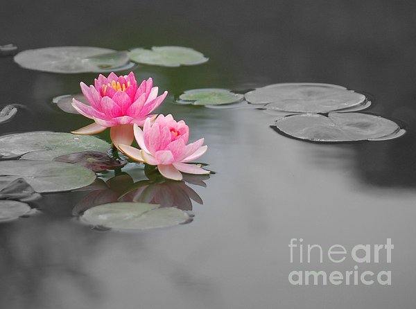
Shape

A shape is an enclosed figure. There is an inside and an outside. Shapes that have special mathematical rules are called
geometric shapes. Examples of geometric shapes are circles, squares, rectangles, triangles, hexagons, etc.

Shapes that don't follow any special rules are called
organic shapes. Organic shapes might look like something you recognize, like a leaf, or might simply look like a blob.
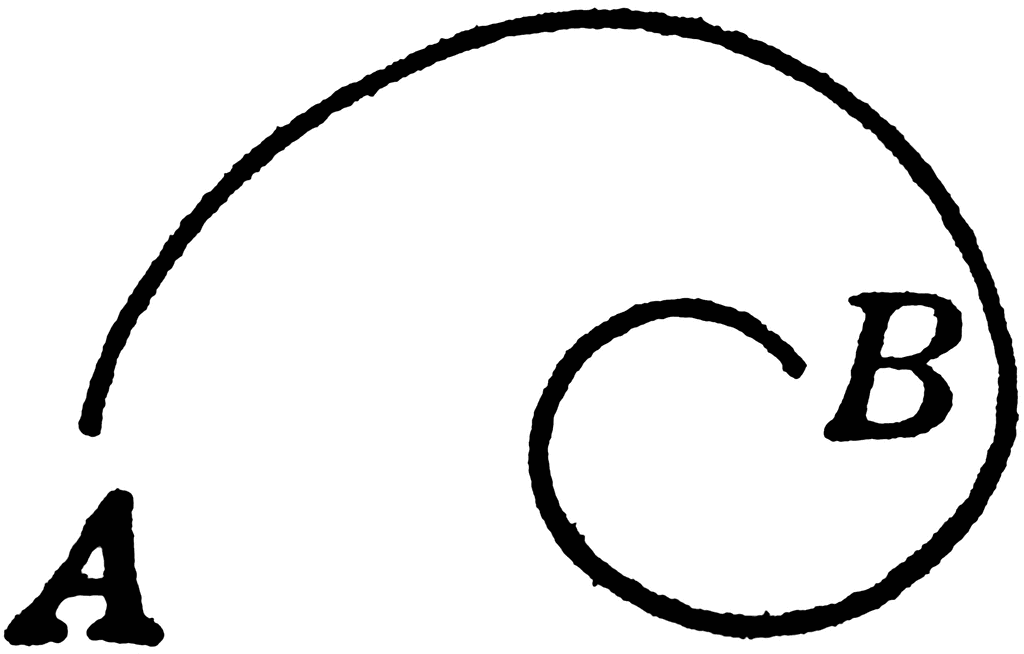
Line
In math, a line is the shortest distance between two points. In art, though, we are more free with the definition. Lines are not closed figures. They are open ended and can move across the paper in many different ways. Lines that follow a predictable pattern are called
geometric lines.
Zig-
zag lines and wavy lines are examples of geometric lines. Lines that are completely unpredictable are called
organic lines. Lines can be thick or thin, straight or curvy.
Color

We have been slowly learning about color every year since 1st grade. Colors are organized on a Color Wheel to help us see how they are related to each other. This year we are reviewing Primary, Secondary, and Tertiary. We will be learning Complimentary, Analogous, Monochromatic, and Triadic for the first time.
Texture
Texture is the way something feels when you touch it, or how it would feel if you could touch it.
If you can really feel it when you touch it, it is called
Real Texture. If you can't feel it when you touch it, it is
Implied Texture.
Value
Value is every tone of a color from the darkest of the dark, to the lightest of the light. When you arrange them in order from lightest to darkest, it is called a
Value Scale. When black and white are arranged in a Value Scale it is sometimes called a
Gray Scale, or a
Key Scale.
Space
When we talk about space in the art room, we are not talking about outer space! Space means creating a feeling of depth. Near and far. Front and back. The illusion of space is created on a flat paper by using
overlap,
size and
placement, and
details.
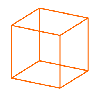
Form
Forms are 3-D shapes.
You can create the illusion of form on a flat paper by shading to show where the light and shadow are, or you can use contour lines. Contour lines follow the surface of a 3-D object.
 Here is an amazing image that demonstrates contour lines!


+dig+pics+015.jpg)