This week in art we are going to focus on drawing faces as portraits.
We will look at images of children who feel happy, sad, angry, or scared (startled). We will talk specifically about what happens to each part of the face during each emotion. For instance, have you noticed that someone who is angry pulls their eyebrows together and/or down so that scrunched up wrinkles show up on the nose?
At home today, you should go look in a mirror and make faces that show emotions! Watch your face carefully to see what each part of the face does during that emotion. We will practice drawing faces that are showing emotions.
Meanwhile, can you look at these children and tell who is feeling happy? Sad? Angry? Surprised?
Tuesday, August 30, 2011
2nd grade - Using How to Draw books
We will be using the How to Draw books for two days. These books are a lot of fun and very educational if used properly. You should not trace out of the book, although I know that can be fun. Follow the steps, thinking about blocking in simple shapes to begin the sketch, then adding detail until you have the picture you want.
After today, the How to Draw books will remain on the bookshelf for students to use if they finish an assignment or project early.
Friday, August 26, 2011
The Principles of Design
...are the rules for using the Elements of Design well.
There are seven Principles (just like there are seven Elements). They are;
Balance, Unity, Pattern/Rhythm, Variety, Proportion, Movement, and Emphasis/Focal Point.
There are seven Principles (just like there are seven Elements). They are;
Balance, Unity, Pattern/Rhythm, Variety, Proportion, Movement, and Emphasis/Focal Point.
In visual art, balance refers to the visual weight of the objects in the picture. If there are too many elements on one side, and not enough on the other, the picture does not feel balanced.
Unity
This means that everything in the picture feels like it belongs there. An example of a picture that does not have unity would be a hot summer beach with a snowman on it.
Pattern/Rhythm
We have all known what pattern is since we were in kindergarten. It is a set of repeating elements. Rhythm is a complicated pattern. Human beings are attracted to pattern and rhythm. We crave it. That is why we make and listen to music! If you can create pattern or rhythm in your artwork, people will be drawn to it.
Variety
"Variety is the Spice of Life". Ever heard that old phrase? Although it is cheesy, it is also true! You don't want to bore your viewers with too much of the same thing. Try using different sizes, shapes, colors, or lines to give your work more variety!
Proportion
This means that each of the parts are the right size to belong to the whole. This is very difficult to describe, but very easy to recognize. In cartoons, the characters are usually out of proportion. The head is too big, the legs are too small; that sort of thing. That doesn't mean that cartoon artists are stupid and don't know proper proportion! It just means that they know the rules of proportion and are breaking them on purpose! If you want to be a cartoon artist, I recommend that you first learn the rules of proportion, so you can do a better job of breaking them when you need to.
Movement
This does not mean that the stuff on your picture moves around! Movement refers to what the viewers' eyes are doing when looking at your picture. You want to keep the viewer looking at your artwork for as long as possible, so you should try to design your picture to lead the viewers' eyes around in it. This is NOT easy!
Emphasis/Focal Point
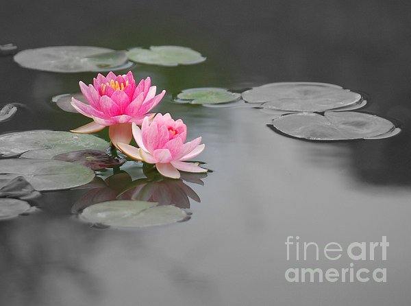
This is the most important thing in the picture. It is the thing you want the viewer to look at first! You should manipulate the elements so that the viewer's eye is drawn to it like a magnet. Notice in the picture above that your eyes are drawn to the pink flowers because the are so strongly different in color from everything else in the picture.
Be careful putting people in your picture unless you want them to be part of the focal point. We are drawn to the human figure, so most viewers tend to look at people in a picture first.
Labels:
5th,
6th,
Teacher - Miss Albaugh,
Teacher - Mr. Christofferson
Thursday, August 25, 2011
The Elements of Design (Visual Art)
The Elements of Design (sometimes called the Elements of Art) are the basic building blocks of art. Artists use these elements to plan and design their artwork. There are seven of them. They are Shape, Line, Color, Texture, Value, Space, and Form.
Shape
 A shape is an enclosed figure. There is an inside and an outside. Shapes that have special mathematical rules are called geometric shapes. Examples of geometric shapes are circles, squares, rectangles, triangles, hexagons, etc.
 Shapes that don't follow any special rules are called organic shapes. Organic shapes might look like something you recognize, like a leaf, or might simply look like a blob.
Line
In math, a line is the shortest distance between two points. In art, though, we are more free with the definition. Lines are not closed figures. They are open ended and can move across the paper in many different ways. Lines that follow a predictable pattern are called geometric lines. Zig-zag lines and wavy lines are examples of geometric lines. Lines that are completely unpredictable are called organic lines. Lines can be thick or thin, straight or curvy.
Color
 We have been slowly learning about color every year since 1st grade. Colors are organized on a Color Wheel to help us see how they are related to each other. This year we are reviewing Primary, Secondary, and Tertiary. We will be learning Complimentary, Analogous, Monochromatic, and Triadic for the first time.
Texture
Texture is the way something feels when you touch it, or how it would feel if you could touch it. If you can really feel it when you touch it, it is called Real Texture. If you can't feel it when you touch it, it is Implied Texture.
Value
Value is every tone of a color from the darkest of the dark, to the lightest of the light. When you arrange them in order from lightest to darkest, it is called a Value Scale. When black and white are arranged in a Value Scale it is sometimes called a Gray Scale, or a Key Scale.
Space
When we talk about space in the art room, we are not talking about outer space! Space means creating a feeling of depth. Near and far. Front and back. The illusion of space is created on a flat paper by using overlap, size and placement, and details.
Form
Forms are 3-D shapes.
You can create the illusion of form on a flat paper by shading to show where the light and shadow are, or you can use contour lines. Contour lines follow the surface of a 3-D object.
Shape
 A shape is an enclosed figure. There is an inside and an outside. Shapes that have special mathematical rules are called geometric shapes. Examples of geometric shapes are circles, squares, rectangles, triangles, hexagons, etc.
 Shapes that don't follow any special rules are called organic shapes. Organic shapes might look like something you recognize, like a leaf, or might simply look like a blob.
Line
In math, a line is the shortest distance between two points. In art, though, we are more free with the definition. Lines are not closed figures. They are open ended and can move across the paper in many different ways. Lines that follow a predictable pattern are called geometric lines. Zig-zag lines and wavy lines are examples of geometric lines. Lines that are completely unpredictable are called organic lines. Lines can be thick or thin, straight or curvy.
Color
 We have been slowly learning about color every year since 1st grade. Colors are organized on a Color Wheel to help us see how they are related to each other. This year we are reviewing Primary, Secondary, and Tertiary. We will be learning Complimentary, Analogous, Monochromatic, and Triadic for the first time.
Texture
Texture is the way something feels when you touch it, or how it would feel if you could touch it. If you can really feel it when you touch it, it is called Real Texture. If you can't feel it when you touch it, it is Implied Texture.
Value
Value is every tone of a color from the darkest of the dark, to the lightest of the light. When you arrange them in order from lightest to darkest, it is called a Value Scale. When black and white are arranged in a Value Scale it is sometimes called a Gray Scale, or a Key Scale.
Space
When we talk about space in the art room, we are not talking about outer space! Space means creating a feeling of depth. Near and far. Front and back. The illusion of space is created on a flat paper by using overlap, size and placement, and details.
Form
Forms are 3-D shapes.
You can create the illusion of form on a flat paper by shading to show where the light and shadow are, or you can use contour lines. Contour lines follow the surface of a 3-D object.
Wednesday, August 24, 2011
Welcome back to School!
Here we are again, with a brand new school year to begin! Every year is a clean slate, with oodles of new possibilities and art projects awaiting us!
This year there are a few changes in the schedule.
The biggest one is that there will no longer be specialty classes on Mondays. That means no art class on Monday. :-( We will just have to fit all our fun and exciting projects into a four day week!
The second change to the schedule is that each term is now a trimester, rather than a quarter. This is actually a great thing, because if we can complete a project within a four day week, we can do more projects than in the past!
The final change to the schedule is the arrangement of classes. In the past, all grade level classes were grouped together in the same specialty for their quarter. That meant that I spent an entire day for one quarter teaching only younger grades. Another quarter was spent only with upper grades. This year, I have one or two classes from each grade level every trimester. From a lesson planning and supply standpoint, this will be more challenging. However, storage of drying paint/clay projects should be easier.
Well, what can you look forward to in art this year?
Lower grades (K-2)
We will continue to spend our art time exploring materials and learning ways to express ourselves visually.
Middle grades (3-4)
While still exploring materials and media, you will begin formal drawing lessons, Elements of Design theory, and clay construction!
Upper grades (5-6)
Art lessons become much more structured and formal. Elements will be reviewed and Principles of Design introduced. Formal drawing lessons will include perspective drawing and still life renderings. You will continue with your clay construction lessons. And new this year, digital photography! Sixth graders can expect to be treated like middle school students and will receive homework.
I am very excited to see your smiling faces this year and I can't wait to see the fantastic artwork you will create!
Subscribe to:
Comments (Atom)


+dig+pics+015.jpg)